
Over the past 5 years I’ve examined vernacular typography through the lens of sign painting, hand lettering, and digital type for boat graphics. Admittedly, it is a narrow area of typographic focus but one that offers a long history and plenty of successes and failures. What came as a surprise was the allure of this typographic form. But first, some history.
Documentation of ship’s names dates back to Egyptian times when pharaohs had highly ornamented vessels named for them. In general, the names glorified some aspect of the pharaoh’s persona, prowess, or reign. The names did not appear on the vessels, but were found in writings as early as 1500 BC.

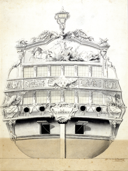
Later, the Greeks and Romans amassed substantial navy fleets in which all of the ships were named. The names were after mythological figures, attributes such as grace and beauty, ideals of power and victory, as well as animals and geography. Many ships had carved and painted ornament, though it is questionable whether those markings were naming devices for the ships or purely for decoration. Historian William Murray argues that by 480 BC names were appearing on warships as is stated in Themistocles Decree of 480 BC. In the few known examples, names were written in all capital letters, as is familiar in the chiseled letterforms of Greek and Roman public lettering.

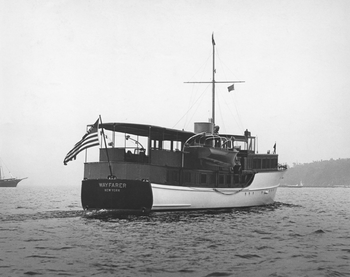
From ancient times through the Renaissance, ships were primarily military or commercial. Their names were documented in various records but very few visual examples remain. Personal watercraft were not recorded so it is not known if they were named, and pleasure boats didn’t appear with any regularity until the early 17th century in Europe. On some of the royalty’s finest ships, names did appear on plaques attached to the transom (back) of the ship. The typography was presented in centered capital letters, or occasionally, script typefaces.
Boat naming has a continuous history following from those earliest ships. Tracing styles from Europe, and then England, affords the best genealogy for American ship names. Traditions such as using feminine names and very straightforward capital letters were carried over to the Colonies and followed. Names were purely functional and typographic experimentation didn’t exist. It wasn’t until pleasure craft truly blossomed in the early 1900’s that the typographic style of boat names started to exercise any creativity. A small exception was the paddleboats of the late 1880’s. Following the style of broadsheets and the ornamental woodcut type of advertisements, paddleboat names could be found in Fat Face or extended serif type paired with drop shadows and outlines. These names were actually fun.
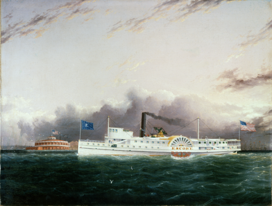
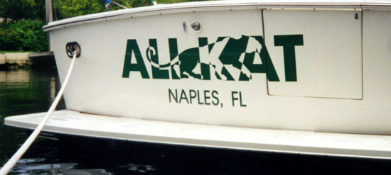
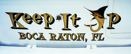
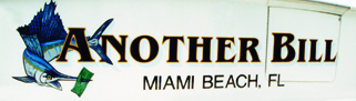
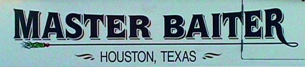
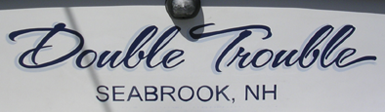
The majority of boat names were painted directly on the hull of the boat either by the boat owner or a sign painter. For the most part the names were utilitarian, a simple naming device for identification. Working (commercial) boats had the name on both sides of the bow (front), along with a registration number, and also on the transom (back). Personal pleasure craft typically positioned the name on the transom only. In all, the lettering was traditional, meaning it was in all capital letters in either a serif or sans serif typestyle.

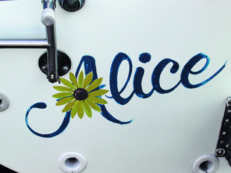
Pleasure boats were the domain of the wealthy and Cornelius Vanderbilt is credited with commissioning the first motor yacht named North Star. Yacht clubs for sailors were established as early as the 1830’s and those racing yachts favored names associated with the natural elements and the challenges of competition. A list of American yacht names for motor and sail was started in 1881, The American Yacht List, which revealed that feminine names such as Margaret and Alice were most common. A few uncharacteristic names listed were As You Like It and Skeidaddle, along with 5 boats named Truant. Go crazy.
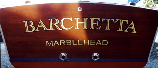
Names and lettering styles were surprisingly conventional throughout the first two thirds of the 20th century regardless of the boat size or means of power. The historical utility of the name overrode the ability to see other design possibilities. Even as innovative commercial signage, company logos, and other forms of communication design flourished, boat names and lettering followed tradition. Sign painters lettered in the styles of Garamond, Bodoni, Caslon and block sans serifs, in a centered alignment. One could consider this a failure of creativity but that wouldn’t exactly be fair. Letterers, although working within narrow typographic parameters, found ways to add nuances and detail to the names, just with smaller moves. Their understanding of “good typography” created well spaced, evenly proportioned and well rendered names. And occasionally some good ligatures, flourishes or drawn elements too.
A breakthrough did come from two different places in the post WWII era—technology and economic prosperity. The 1960’s brought fiberglas technology to boating, which by the 1980’s dominated boat construction, and forever changed the way boaters thought about their boats. And in the 1980’s, traditionally hand lettered boat names were challenged by a new technology—vinyl cut letters. Both technologies, while initially resisted, eventually won out for their ease, durability, and innovation. The 1980’s also enjoyed an economic boom typified by a huge surge in boat ownership. This confluence encouraged more personal and inventive names and typographic solutions, whether you enjoy their zaniness or not. The emphasis on corporate identity in professional design, along with a greater awareness of design by the public, trickled down to boat owners interested in branding their possessions. And sign painters who embraced technology delighted in the greater creativity afforded by it, as well as by the acceptance of looser naming conventions.
Currently, boating in the US is a 70 billion dollar industry including over 18 million boats. No small numbers for successes, failures or allure.
The Failure May Seem Obvious
Now, in contemporary boat lettering and graphics a DIY culture exists alongside the professional letterer’s craft. In a healthy percentage of DIY boat names a failure is plainly evident: poor typographic choices, bad letterspacing, unimaginative solutions, or even worse, overly imaginative solutions. A trained designer can spot a DIY name from a dock away. Some are just groaners, and others are appallingly bad. But many of these failures shouldn’t entirely be blamed on the DIYer.
Web-based online boat graphics software available to consumers has as many good features as bad. The software limits creativity in some areas and offers bad typographic options in others. Limitations such as having to design the name and hailing port separately makes the boat owner think of them as distinct elements instead of a single unit, which doesn’t afford compositional integration. Other software functions give too much flexibility allowing for letterforms to be distorted in unacceptable ways. Wacky, ill-proportioned type, “slanted” type, and type poorly positioned along arcs are the most common offenders. Because the options are there, boat owners will try them, like them and use them.
Typography snob that I am, at first these “type crimes” (to borrow Ellen Lupton’s term) were deliciously troubling. I was always on deck looking for the next bad example to document for my photo archive. The archive grew really fast, sometimes exponentially, just at a single marina. There was a certain delight to their failure. But once I examined the DIY culture in boat graphics more closely, I understood that it wasn’t simply bad taste, and that there were patterns to some of the “crimes.”
There is a fear (and failure) by designers to encourage good typography for all. To paraphrase Roberto de Vicq de Cumptich, “typography is the only aspect of design that is truly a designer’s.” Which means that it is the only element of communication design for which we can prove our knowledge and expertise. To use a boating analogy, anyone can tie a knot, but a proper sailor’s knot surpasses a landlubbers in both function and style. The difference is, you can buy a book that teaches knot tying, but up until recently, designers held the secrets of typography pretty close. In our open source culture, typography and design shouldn’t be held close anymore. We shouldn’t be afraid to reveal what is behind the letterform. The time for gloating, or disappointment, in what the general public does and understands about typography is over.

In my experience, boat owners and novice sign shop operators are interested in learning about type and would like to have good tools to use. In the same way that other industries, especially photography, have developed “pro-sumer” cameras, scanners and Photoshop-like software, designers and typographers should lend their expertise in a variety of ways. One of the most simple is to work with developers of software and type tools. Imagine if Microsoft Word and PowerPoint actually promoted good typography by the way the tools were used and the menu choices available. Software with good customization and creative options could elevate understanding, instead of standing in its way. Imagine if boat graphics software had well designed artwork instead of cheesy clip art. Or, if the customer was able to make their own graphics from a high-quality kit of parts. We’d see a lot more floating typographic beauty.
This is in part a failure at the educational level. Training prospective designers for practice is expected, but what if that practice includes more emphasis on making typography accessible instead of being in control of it? Not enough design programs are emphasizing typography as an area of expertise that can be parlayed into engineering, science or technology. Yet.
The Allure May Seem Unfathomable
Current boat names range from traditional to kitsch and from cerebral to sometimes embarrassingly personal. And that’s just the name itself. The design of names has a narrower range often somewhere between acceptable and awful, with a few beauties occasionally. My experience while showing boat name images to designers is to get belly laughs and groans. So what makes them alluring?
If you step away from the formal typography and design decisions for a moment and start to focus on boat names as mini-brands, all of the sudden, they get even more interesting. When you know that the name is a memorial to a lost family member, or conversely, the name is unabashed self-glorification (or TMI), it opens up a whole new look at contemporary culture. It also begs the question, why so many double entendres and braggarts?
A few statistics can help tell the story. In a 2005 Sports Illustrated online survey 22% of boaters said that coming up with a name for their boat was harder than naming their children or pets. And according to Boating World’s Top Ten Boat Names, Aquaholic and Seas the Day have been consistent winners since 2002. Why? As was evident from the brief history, naming is not new. People name all sorts of personal possessions including their computer hard drives. Take for instance vanity license plates for cars. They have been available since the late 1950’s and common since the 1980’s, and there is a certain level of ingenuity or creativity involved in delivering that message clearly through text.
What makes boat names different is the visual manifestation of the name. Presumably, with a boat name you can convey whatever you wish, there are far fewer limitations than a license plate or a commercial logo. Yet interestingly, you don’t see as many names in which the design is overwhelmingly inventive or as personal as it could be. There is a moving line between customization, personal expression, and the notion of originality. Online software can give the feeling of personal expression (or even originality for some folks) when in fact it is offering limited customization easily replicated by another user. A good professional letterer has the imagination and tools to create original work, although customers requesting that type of solution don’t come along as often as you’d expect. And now with three-dimensional illuminated boat signage on megayachts the fascination with technology can override the typographic ingenuity. Having said all of that, there are some beautifully executed names in all categories.


Tradition does play a role in the design if you consider that it’s taken roughly 3000 years to get to this level of creativity. For some boat owners, name identification is still the primary goal, just as it has always been. And for others there are connotations associated with certain boat sizes and styles that are perpetuated through the design. Sailors are known to be more traditional and cerebral, while power boaters, especially those with smaller sized boats are described as goofy, fun-loving or egotistical. As a possession, a boat does make a statement about the person.
In our blogging, twittering, social networking culture, boat names as personal mini-brands could be more expressive in a “check me out” kind of way. Perhaps they’re not because, being adhered to a transom, they’re more permanent than fleeting? Or, because more boat owners are baby boomers than millennials? Or because boat names integrate text and images? The next generation of boat owners could be the ones to break with tradition, and personally I’m curious to see if they will.
So…there is allure in finding really good names. There is allure in knowing the stories behind those names. There is allure in appreciating vernacular typography for the cultural snapshot it provides. And of course as designers, there is the presumption we could create something more alluring, just given the chance.