I’ve been fascinated with neon signs since I first arrived in the US in 1991: along with the twinkling skyline, it characterizes the excitement of the American city at night, but unlike the giant LCD billboard or the floodlit building, neon comes with a highly visible flipside, a kind of sadness in its daylit, dysfunctional state, that makes its nighttime persona burn brighter and with more intensity. There’s incredible pathos in this contradiction, between the backside of neon, with its blackened tubes, tangles of wires, transformers and then the unearthly glow of a rare gas charged at high voltage in sealed tinted glass , yielding a delicious array of colors: cobalt blue, hot pink, blood red and emerald green.
I think this pathos, coupled with the bombastic, persuasive, imaginative and desperate content of the signs’ messages, helps make neon typography a kind of urban poetry of yearning, yearning for something that is patently not there, which is the essence of advertising.
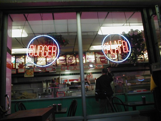
Neon is constantly promising and offering, in the sky, on windows, buildings, clouds, creating an illuminated textual overlay through which we consumers read the world. The effect of the neon textscape is to make the state of desiring a constant condition. What do I feel like? Burger or falafel? Falafel or burger?
Typographically speaking, it is quite an extraordinary mechanical—not digital–mutation of the printed letterform. I talked to some neon sign makers in Austin, and the technique is unchanged since the 1930s.
It struck me that the whole neon medium is characterized by a kind of typographical failure, or at least, compromise. First, the fact that discreet letterforms are not a very practical solution when you’re bending glass, at least at small scale; it is generally more economical and efficient to make an entire word out a single glass tube, in sections up to eight feet long per transformer (which is as much gas as the transformer can charge up). But as most designers and even design critics know, making display type using script fonts is a short cut to illegibility, particularly if in the production your letterforms are going to bleed excessively. So while the glass tubes require continuity, the glow of light, the bleed, requires separation to make it readable. The solution is to paint the tube black in the connecting sections, so that the letters appear discrete. Legibility is achieved by simply painting out parts of the letters, rather like tweaking your newly designed typeface by applying correcting fluid to the stems, serifs and ligatures.
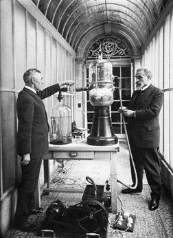
The inventor of neon signs, the French chemist Georges Claude, was actually seeking to make cheap oxygen for hospitals and welding equipment, by the fractional distillation of liquid air, a process invented a few years before him. When you distill air to get oxygen you also get large amounts of leftover rare gases like neon, xenon, krypton and argon, and Claude’s breakthrough was to develop a reliable method of sealing the gases in glass tubes and bombarding them with electricity to create a light source. The idea was inspired by Moore’s Lamp, an invention of the American Daniel McFarlan Moore, a former Edison employee, who thought Edison’s incandescent lamps were “too small, too hot and too red”. Seeking to create light without heat, as the glowworm does, Moore put carbon dioxide and nitrogen in tubes and ran a current through them. Claude did the same thing with rare gases, discovering that by coating the inside of the glass he could increase the range of his basic colors (neon glows red when charged, argon glows greyish blue: coat the neon tube white and you get pink, coat it yellow and you get orange, add mercury and it glows brighter, or turns blue at temperatures below 30 degrees, causing certain neon lights to function as unintentional thermometers.) 99 percent of neon lights contain neon or argon.
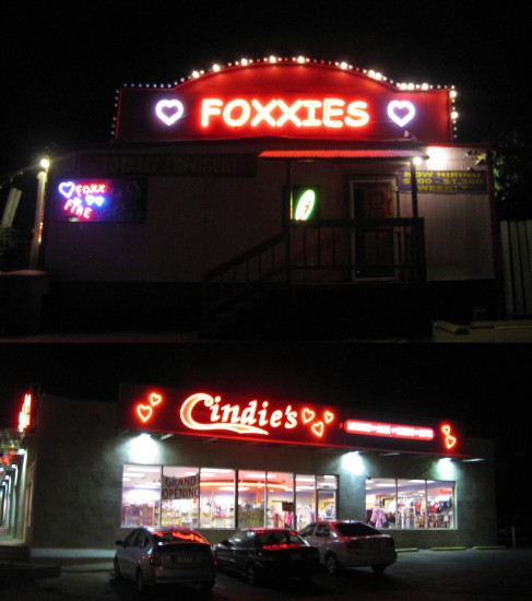
Claude called his invention, which he was quick to patent and commercialize, a “living flame”. But in the very core of neon lighting is this idea of desire: light is created by bombarding, or exciting the molecules of a rare or noble gas. Perhaps that’s why adult boutiques and strip clubs choose neon.
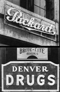
The very first neon sign in the US was for the Packard car dealership in LA, sold by Claude Neon for $24000, in 1923. The sign is apparently still functional. Images of the Packard and a mid-1920s drugstore sign in Denver show how the neon crudely accents the more adept typography of the sign maker, functioning as a relief element. The Packard sign reportedly annoyed local police for causing drivers to stop and gawk. And therein lies the key to neon’s sudden proliferation in the US: in a car culture, information needs to be quickly and processed by the brain, both by day and by night.
Nowhere is this more dramatically illustrated than in Las Vegas, which as Robert Venturi, Denise Scott Brown and Steven Izenour argued in their seminal postmodern work Learning From Las Vegas, exemplifies an architecture of communication over space, an architecture of persuasion, to the point that without the signs, there’d be no town. Venturi & Co’s efforts to re-evaluate Vegas through audacious comparison with the Roman piazza, needs little introduction. Vegas, they argued, simply functions at a different scale and speed and rate of change to Rome, it just traded processional arches for billboards and its mosaic for flashing neon:
“The mechanical movement of neon lights is quicker than mosaic glitter, which depends on the passage of the sun and the pace of the observer; and the intensity of light on the Strip as well as the tempo of its movement is greater to accommodate the greater spaces, greater speeds and greater impacts that our technology permits and our sensibilities respond to.”[Learning fron Las Vegas, 116]
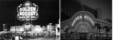
Venturi, Izenour & Scott Brown purposely archly refrained from overt moral judgment in their architectural appreciation of Vegas, confining their analysis of the Golden Nugget casino, for example, to its transformation from “decorated shed with big signs” in the 1950s to “all sign” with “hardly any building” visible in the 1960s—evidence of the high speed one-upmanship that drove the city’s skyline into fantastical realms. But an analysis of neon typography could not go without a discussion of its associations with gambling, sleaze and a kind of environmental insensitivity.
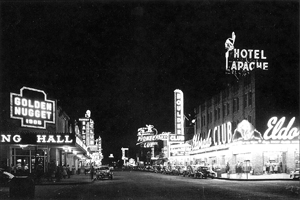
Named “The Meadows” reportedly by the first foreigner to discover it, Rafael Rivera, Vegas was a Mormon settlement in the 1850s that became a railroad town in the early 1900s famous for its gambling clubs, liquor stores and “fancy houses” of ill repute on Block 16. The town suffered a crisis after the Hoover Dam was completed in the late 1930s, briefly diminishing its visitor numbers with the dispersion of dam workers, but was rescued by the gambling kingpins of Southern California, who opened the Pioneer, El Rancho and Last Frontier in 1942, followed by Bugsy Siegel, the New York mobster in 1946 with the Flamingo. 10 million tourists visited in 1953, apparently untroubled by the Atomic Energy Commission’s surface nuclear tests in the nearby desert.
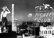
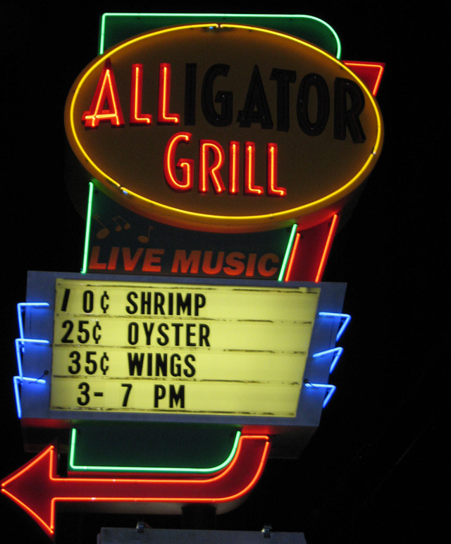
With its transformers increasing voltage to as much as 15,000 volts per tube, neon signs are know for their audible buzz, a buzz that also recalls the buzz sought by compulsive gamblers, who, according to one anthropological study, play not to win but to achieve a dissociative subjective state they call “the zone” where the boundary between the player and machine dissolves. The worst thing that can happen is to be intruded upon. Along these lines, casinos were named and designed after exotic, dissociative “escapes” from present day reality – the pre-and post-World War Two references to Wild West frontier towns gave way to Sputnik-era, space age escape (as with this 1958 sign designed by Kermit Wayne), Barbary Coast treasure, Sahara oases, mirages, the circus and El Dorado, empire of the legendary golden king in Colombia. The promise of wealth is often present in the casino’s adopted mythology, but it is often the job of the architecture, the windowless casino interior, and the neon sign, to suggest that those who enter will be taken somewhere else, somewhere out of themselves.
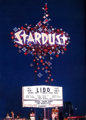
But while Vegas casinos were outdoing each other to construct the largest and tallest neon signs–Stardust’s was 188 feet, the Dunes 180 feet, the Frontier 184 feet—the rest of the country was not so enamored with the Sin City associations. The ongoing suburbanization of America, with middle classes and businesses leaving urban centers and their buzzing signs in states of disrepair, meant that sputtering, arcing and burnt out neon signs were seen as symbols of crime and urban decay. Local governments passed ordinances restricting or outright prohibiting the use of exposed neon, many of which are still in place. Businesses increasingly turned to more weatherproof, typographically versatile and respectable plastic box signs illuminated from within by fluorescent light. One conspiracy theory has it that the petrochemical giants actually peddled this image of neon as sleazy, in order to promote their “clean” plastic light boxes. Contrary to popular opinion, neon is a more energy efficient light source than incandescent light, and not far off the efficiency of fluorescents, which are basically the same thing, argon gas excited in a slightly larger tube requiring less energy.
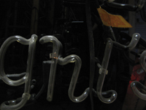
I think it is the visceral, tangible nature of neon and its mechanical inflexibility that makes it so interesting, typographically. This Austin sign caught my eye because of the quirky typeface with those strange little connectors linking the little circles to the perimeter outline neon. According to Todd Sanders, a local vintage sign designer, those are actually unintentional: the block out paint has just worn off.
The decline of neon has made it a ripe subject for a kind of cult status: the famous neon boneyard of the Young Electric Sign Company in Vegas was never an official tourist attraction but was picked over and photographed by thousands of visitors intrigued by the idea of the detritus of a fickle consumer culture. YESCO’s founder Thomas Young had begun keeping old, broken and obsolete signs in the company’s back yard as a source of spare parts that proved invaluable during world war two. As the pace of change required ever bigger and better signs, the boneyard grew into a destination, full of what one director described as “carnage of hype”. Scenes from Mars Attacks! and Vegas Vacation were shot there.
The boneyard proved a fruitful resource for Las Vegas residents who began to realize that there was a certain nostalgic value in the city’s short, luminous history. In the late 1990s, the city signed an agreement with YESCO to launch a campaign to restore and reinstall around the city some of the more impressive signs and call the collection a Neon Museum. The first signs went up at the end of the decade, a curious collection of advertisements for absent attractions. The Flame restaurant sign, rescued from the roof of an early 1960s diner long since demolished, features a long, swooping pink arrow pointing to a void where food was once served. The Fifth Street liquor sign shows a disembodied red hand puring a green bottle of pink liquid into a floating blue martini glass, but the thirsty will be unrewarded by snooping around the sign. The Chief Hotel Court sign originally installed around 1940 can now be found on the northeast corner of Fremont Street and 4th Street, where tourists gather to watch a newer more sanitary computer controlled light show projected on the underside of a steel canopy.
Neon today struggles to shrug off the stain of history, but remains fairly ubiquitous as a component of a lighting designer’s palette. It has an unmatched ability to delineate architectural features, even mediocre ones, at night.
Somehow it lacks the exuberance today of, say, the 1953 Flamingo champagne tower, with its filigree of neon bubbles wrapping an 80 foot cylindrical tower by architects Pereira and Luckman, topped by six foot neon letters. It served no other programmatic purpose than to be looked at, and was thus the first “spectacular” on the Strip. (Design: YESCO)
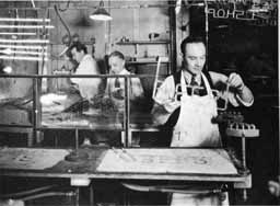
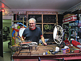
The nostalgia factor, and neon’s associations with a sexier, sleazier motoring age has played a part in its predominance in Austin’s nightscape, where the city prides itself on a certain liberal quirkiness and willingness to host the itinerant rock and roll community. Because glass tubes are fragile and not easy to ship, it is quite common to find neon sign makers operating as small shops, each with their own quirks and methods. Of the four neon sign shops I contacted, however, only one was operated by a glass bender; the others farm out that task, which is a serious craft learned over years. The old skills are not passed on, because the master benders from neon’s heyday all happened to die during the neon slump. Austin-based Todd Sanders, who apprenticed as a bender, found it tricky and time-consuming, and now subcontracts the task, focusing instead on drawing the signs, and overseeing production. Sanders sometimes restores signs from the 1930s that, he says, reveal incredibly tight workmanship, with smooth bends unachievable by today’s benders.
John Hayward trained as a commercial artist in Portland Oregon then took up neon bending in the 1980s. He’s recently downscaled, seems to be hurting for business and doesn’t own a bending facility, but he does it at a nephew’s facility. Hawyward stresses a good drawing: once the glass is bent, there’s no going back: the thickness of the glass changes when it is hot, meaning that the uniformed manufactured surface cannot be reinstated.
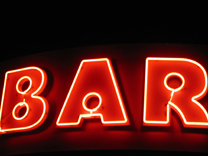
Both Sanders and Hayward cited the cardinal rule of neon signs: legibility. Because of the night time glow, the line produced is a lot thicker than the one you draw, and the most common mistake is for sign makers to design a sign with the tubes too close together making it illegible at night. Because of the public’s familiarity with fonts, it is common for a customer to request a neon version of a logotype, or to request a relatively intricate serif typeface. Hayward’s response is usually “there’s only one.” Typefaces can be approximated by painting them and then using a line of neon to accent them, the most elegant method, as used in the 1920s Drugs sign. A more spectacular method is to use double sided neon, as with the Bar sign, but this often leads to blurry legibility.
Tight bends require the tube bender to blow short puffs of air through the glass to increase airpressure and stop the tube closing up. Kinks and wobbles sometimes appear, which, depending on the craftsman, require a new tube or can be passed off as flourishes, the bender knowing that few examine a neon sign close up.
Sanders and Hayward both agree that computers can’t letterspace for signs but have a difference of opinion over Helvetica, which Hayward uses as the basis for many of his signs and Sanders avoids like the plague, calling it “devoid of any soul” and lacking the right spacing for neon.
Sanders’ specialty is making entirely new designs that look as though they’ve been around for years, which, he says “lends heritage to your company” and which he ships mostly to companies in big cities like Chicago and LA. Doc’s Motor Works, a burger and beer joint in Austin that opened a couple of years ago, is sited in a former garage, with rolling garage doors and outdoor tables on asphalt to match. Sanders made a sign on the garage theme that even appears to reuse an old sign, turning “body and garage” by day into “bar and grill” by night with neon overlay. For inspiration he studies and collects obsessively sign painters’ magazines and books like the “Speedball” books of the 1930s and 1940s, and the still-published “Signs of the Times” magazine (established 1906) where he finds pleasing cuts of Gothic (his preferred default neon typeface) and practical advice from the master sign painters on what light colors go together and diagrams of the most common mistakes in drawing letterforms.
But it would be wrong to imagine that neon is now limited to a kind of neoclassical existence, reviving its past glories in brilliant crafted evocations. The post war denigration of neon was paralleled by–and probably was even a contributing factor to–the art world’s embrace of it. Neon’s color, glow, textual applications, ability to simultaneously outline and make ephemeral, and its lowbrow, commercial connotations all helped make it an attractive medium to conceptual artists in the 1960s and 1970s. Mario Merz’s Unreal City of 1968, which draws from those qualities to suggest something fleetingly human within the technological standardization of contemporary life. Bruce Nauman’s 1983 work “Life Death Knows Doesn’t Know” uses the bombastic qualities of neon and the animated flashing on and off of words possible with transformer switches to make seemingly contradictory pronouncements.
The New York-based Lite Brite Neon Studio started up ten years ago and has turned into a significant force for custom neon for artists and high end retail. To reverse the idea that design feeds off art, consider this Lite Brite technique of painting the tubes so that they only glow at the back, a brilliant riff on the black-out method that Lite Brite did for Burberry’s in London. A New York artist Glenn Ligon saw the technique and used it to make “Negro Sunshine” in 2006, using a Gertrude Stein phrase to explore the subjects of pop culture and African American identity. Then DKNY approached Lite Brite to use the same technique. Lite Brite’s founder Matt Dilling considers neon to be a fairly young medium, in a healthy state with plenty of possibilities.
So in conclusion I had planned to describe neon typography as a character, an actor who embodies three kinds of failure that all contribute to its poetic richness in the urban landscape: first a semantic failure to live up to its own promise of escape, since as an advertising medium it must always make unachievable promises.
Second a failure to rid itself of the stigma of decay and waste; despite its inherent magical qualities and versatility it has been irreversibly tainted by associations with sleaze, sin and crime, or at least, gambling.
And third, its technical failure to achieve the virtuosity of its successors, fluorescents under plastic and LED, which trumps neon for versatility.
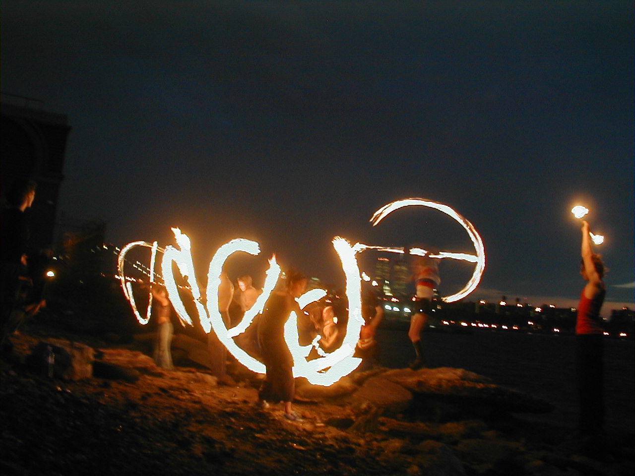
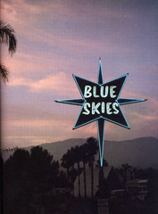
But Matt Dilling had a slightly different conclusion that I like better, since it spoke to the same impulse that made me want to show this photo I took of some performance artists practicing on the Williamsburg waterfront in the late 1990s. Dillion was attracted to neon in much the same way that insects are attracted to light, he says. He noted that the first electric light spectaculars came to the US at the same time as Eastern Mysticism, at the Columbian Exposition in the late 19th century. “It has a nice place in history” he said of neon, “it’s attached to all the good things: religious iconography, sex and food, to believing in something larger.” So underlying all of this is a fascination with the spectacle, and a fundamental desire to dance with light.