Architectural Failures
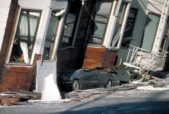
As architecture folk, a practitioner and a historian, we were interested in extending the idea of “fail again” to the built environment, and we began by being as literal-minded as possible.There are many ways for architecture to “fail” and some, like a structural failure, can be catastrophic, a matter of life and death.Other failures are less dire though still haptic and palpable, as when a building fails to accommodate the program or satisfy the function for which it was designed—a concert hall with poor acoustics or a parking garage with poor circulation.
For us, the most compelling form of architectural failure is also the least tangible, although it has been a disciplinary concern since the eighteenth century.Back then, as the canons of architectural authority were challenged by relativist aesthetics, theorists became preoccupied with the notion of caractère.As Germain Boffrand wrote in 1734, “Different buildings should, by their arrangement, their construction, and by the way in which they are decorated, proclaim their destination to the observer.”In other words, the building should express the character of its occupant and communicate its function.

“What we’ve got here is failure to communicate.” Cool Hand Luke, 1967
It is a fundamental assumption of architecture that all buildings communicate, that through a particular configuration of form and space they impart or transmit various types of information.But how and what architecture communicates is not as simple as it seems because form and space are essentially abstractions, and deriving meaning from them, whether consciously or unconsciously, requires acute understanding at once primal and sophisticated, emotional and intellectual.And while a classical column is just as abstract as a modernist piloti in terms of derived meaning, in the 20th century, in particular, architecture was accused of failing to communicate with its public.
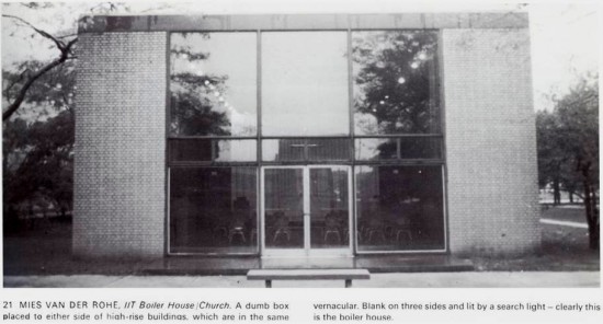
Charles Jencks, post-modernism’s chief apologist, argued that metaphor, syntax, and semantics had collapsed in the architecture of the modern movement resulting in incomprehension and misunderstanding.What was especially troubling for Jencks was that the stripped and simplified surfaces of modernism had rendered buildings mute; they had become, in effect, dumb boxes. Only a return to sign and symbol could resuscitate a dying architecture and make buildings speak once more.
With apologies to Monty Python
A recurring bit from the first season of Monty Python’s Flying Circus, “How to Recognize Different Types of Trees from Quite a Long Way Away,” ironically demonstrates the limits of Jencks’ analysis of buildings.
Click here to view the video on you tube
Like the enigmatic narrator who keeps repeating the phrase “the larch,” Jencks refuses to acknowledge that signs and symbols are inherently unstable in their capacity to carry meaning and that meaning itself is frequently inscrutable.The ridiculous lessons of tree recognition are echoed in this slide show exploring the absurdities of architectural form and typology. It’s called “How to recognize different types of buildings from quite a long way away.”
Click here to view our slide show
Does a McMansion really communicate “house” more effectively or successfully than the Villa Savoye?Or is it just an old habit based, as Rudolph Wittkower observed in Architectural Principals in the Age of Humanism, on Andrea Palladio’s erroneous assumption that the temple front originated on ancient Roman houses?We’ve been living with that mistake for over five centuries now.
If it Quacks Like a Duck
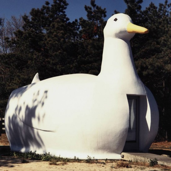
When Robert Venturi and Denise Scott Brown famously distinguished the “duck” from the “decorated shed” they were attempting to clarify the ways in which architecture (mis)communicates.The building-as-duck was a kitsch variant of architecture parlante, or speaking architecture, itself an extreme manifestation of eighteenth century notions of caractère: a building shaped like a duck must have something to do with ducks; a building shaped like a donut must have something to do with donuts, etc.
For Venturi and Scott Brown this was highly problematic because it meant that meaning, which is notoriously dynamic with respect to program and function, was tied directly to form, which is notoriously static because of a building’s inherent, or at least perceived, permanence.If meaning changed and form didn’t then the building failed. It was, in essence, a duck that couldn’t quack, a duck that mooed or barked instead.To put it another way, the quack-as-communication is about as comprehensible as gibberish.How can you understand a donut-shaped building that sells beer?
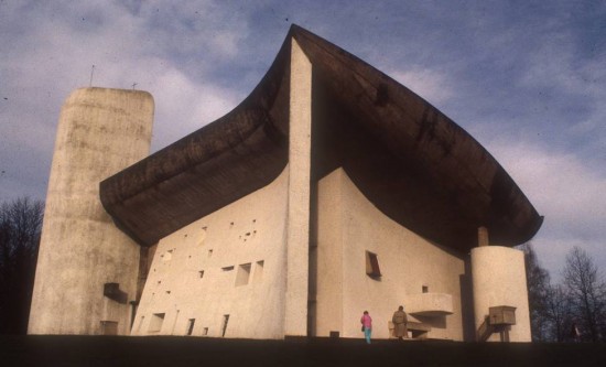
Going further, Venturi and Scott Brown argued that some ducks failed to quack right from the start, especially in late modernism when heroic form-making eclipsed what they saw as a wrong-headed but sincere allegiance to form-follows-function. Though Le Corbusier’s Ronchamp is utterly beautiful and immensely moving, its abstraction renders metaphor all but useless. It is surely no accident that Corb wrote about “the ineffable” just as the building was completed; it is, literally, unspeakable. From a Venturi/Scott Brown p.o.v. the chapel doesn’t quack.
Though they conceptualized the duck in the early 1970s, and doctrinaire postmodernism has come and gone, things haven’t changed all that much in the past few decades. In fact, ducks have continued to breed like, well, rabbits.
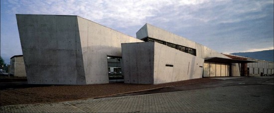
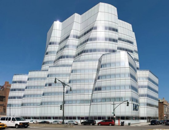
Hadid’s Fire Station in Vitra and Gehry’s IAC in Manhattan don’t quack much either, despite some expressionistic flair that nods, respectively, to program and context. But what to do when the Fire Station houses furniture instead of tense, muscular firemen? And what happens when there are no more tall ships on the Hudson to remind us why a speculative office building on the river looks sort of like sails full of wind?
Almost All Right?
When they defined the decorated shed as “architecture as shelter with symbols on it,” Venturi and Scott Brown meant to offer a deliberately populist solution to modernist architecture’s communication breakdown.They thought they were making the dumb box speak and giving architecture its voice back.But in so doing, they muddled the notion of architecture as the purposeful manipulation of form and space and surface.In the decorated shed, form and space are neutral and only the surface is charged with intention and meaning.3-D is inconsequential; only 2-D matters; architecture takes a back seat to graphic design.
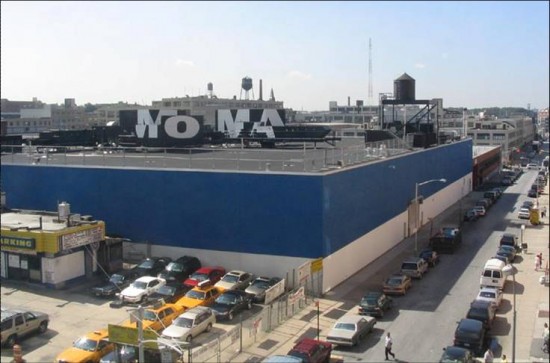
Whether the decorated shed is a Wal-Mart or a MoMA, graphics are required for effective communication.But if graphics are what is making a building-as-decorated shed speak, isn’t the architecture still failing to communicate?
Dead Duck
If duck buildings fail because their capacity to communicate is predicated upon obsolete or abstract form and decorated shed buildings fail because their capacity to communicate relies on surface rather than space, architecture as architecture would seem to find itself in an increasingly tenuous position with respect to the culture at large.Buildings may shelter us as humans, but they fail, in a Heideggerian sense, to house our humanity.
Still, it is too depressing to relinquish all hope for architectural recuperation.And since Fail Again challenged us to examine design failures for evidence of progress then, of necessity, we must continue to interrogate the antithetical architectural failures of duck and shed in order to mediate their spatial/surface extremes.
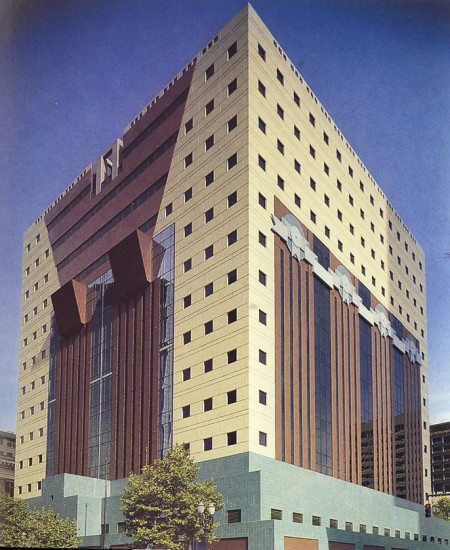
Michael Graves’ Portland Building achieved instant notoriety as a post-modern decorated shed par excellent:a dull box of standard-issue government office floor plates done up in cartoonish, pseudo-historical drag.But around those fancy facades, lingered a faint whiff of the barnyard.With its pedestal-like base and over-scaled indifference to its site, the building is more than a little ducky.Indeed, in proclaiming “I am a monument,” it very nearly quacks.
But really, who cares?The Portland Building is nearly three decades old and its polemics are as dead as Philip Johnson. In fact, that is precisely why we should care: now that the ideological fires have died out, we can look at the Portland Building and realize that in his throw-away combination of duck and shed Michael Graves improbably pointed a way forward.
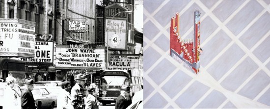
Or maybe there was just something in the smoggy air of the late 70s–after all, while Graves was playing with his pastels in Princeton, Rem Koolhaas (with help from Zoe Zenghelis) was wandering the streets of delirious New York looking for the architectural future in the commercial past of Coney Island and Times Square.
And what did Rem discover?That fantasy, desire, and the unconscious are important characters in the performance of architecture.That mutations, mongrels, and hybrids are far more interesting than formal neutrality and typological purity.That exploring the tension between space and surface is far more productive than complaining about the failures of their strict opposition.
Design Tools
In the past few decades the productive tension between 2D design and 3D design has yielded a new critical dimension in contemporary architecture, one that most decidedly represents progress founded on earlier failures.While the theoretical and practical investigations that followed postmodernism’s attack on architecture’s supposed communication breakdown are partly responsible, so, too, are more recent technological advances.
In addition to obvious design developments like CAD and 3D modeling software,LED skins and digital projections, laser etching and silk screening, and CNC milling and casting have given architects communication tools far more sophisticated than the signage/surfaces of an earlier generation of decorated sheds.
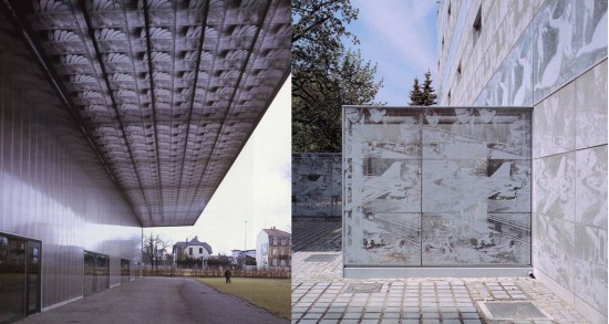
In the 1990s Jacques Herzog and Pierre de Meuron designed several highly-refined buildings that demonstrated how to effectively deploy these new tools for communicating in architecture.In eastern France, medicinal herbs screened onto polycarbonate panels speak of a Ricola cough drop factory; in eastern Germany, old master paintings and newspaper photographs imprinted in concrete speak of a technical school library.
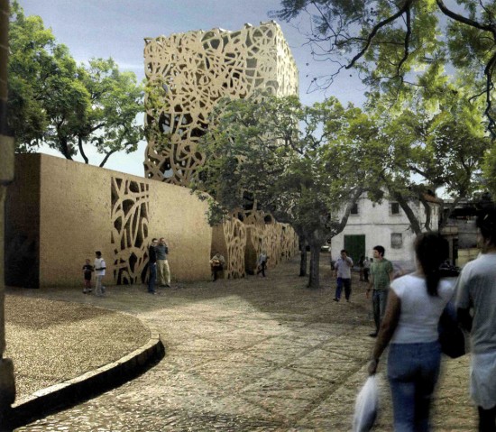
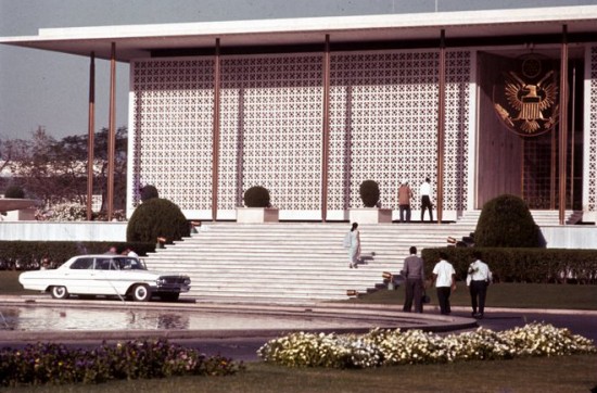
In 2003, for a cultural center located in birth place of flamenco in southern Spain, they proposed a series of perforated concrete screens that were, appropriately, half Gypsy and half Arabic.The architects called these “an iconographical topography,” but they were also a glamorous flourish, a 21st-century algomrithmic adaptation of 1960s Edward Durell Stone.
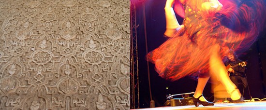
Either way, in their dynamic arabesques the concrete screens recall the decorative motifs of Moorish architecture as surely as they conjure images of pulsating flamenco dancers decked out in batas de cola and mantones.
In all three buildings, the cool clarity of Swiss diplomacy has replaced the loudness of Las Vegas populism, though not without wit and humor. And while these buildings have an affinity with the decorated shed, they are better understood by what we call the graphic box.
Too Graphic
In the decorated shed communication is extrinsic and applied, like an embellishment or ornament; in the graphic box it is intrinsic and more difficult to separate from the materiality of the building. In the decorated shed that which communicates is ON the building; in the graphic box, it is OF the building.
The graphic box is graphic not only in its relation to graphic design–though this is obvious and important–but in its ability to be vivid, explicit, and unequivocal. If the decorated shed is a one-liner, the graphic box is a money shot.
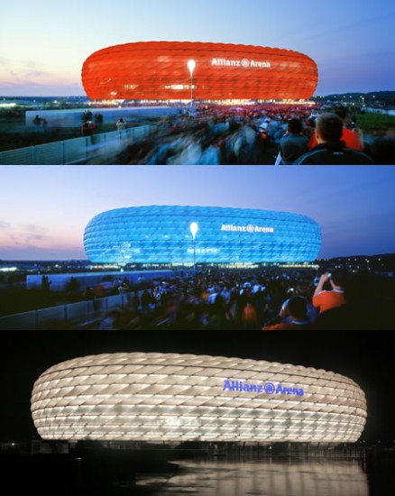
In Herzog and de Meuron’s recent work, boxes have given way to programmed, though not programmatic, form-making.The 2005 Allianz Arena in Munich is an uber-modern, uber-functional coliseum that emanates glowing color–red, blue, or white–depending on which of three home football teams is playing that night.
This building says “sports stadium” in a language as ancient as the Romans and as contemporary as the World Cup. And in speaking an unabashedly architectural language, this building just might lay to rest, once and for all, the surface vs. space communication canard.
The duck is dead. The shed is dead.
Long live graphic architecture.
[Our ruminations on graphic architecture are continued in How to Look at Buildings from Quite Close Up]
