So there we have it – another DesignInquiry has come and gone. And now we look forward to that long interim period between now and next year’s event when the ideas and theories espoused at DI are pondered, gestated and perhaps even acted upon. It is also a period of new postings on the DesignInquiry website, set in the redoubtable Courier, a.k.a. the DI Type.
I have never cared for Courier as the DI Type and could never understand why it was chosen in the first place. It seems too brutal, too austere and bureaucratic, too authoritarian in a dried-up, encrusted, politburo kind of way. Perhaps it was chosen because it was felt to have a “neutral” personality and would allow anything to happen around it. But to me, it doesn’t allow creativity at DI – it preemptively forbids it.
The problem is that there is no DesignInquiry in Courier. It contains none of the left-brain activity, none of the wild tangents, the camaraderie or the spontaneity. Moreover, it lacks the thing which is the heart and soul of DesignInquiry; the thing that is present every day at DesignInquiry and keeps people coming back again and again:
Bacon.
So in today’s workshop we shall add bacon to the DI Type. In the age of OpenType, when you can have high performance fonts on your computer, adding bacon to Courier is a fairly simple task and, frankly, I don’t know why Adobe or Microsoft didn’t think of this a long time ago. Think of the marketing value. Think of the sales. Do you wish for the passionate, loyal following and cult status of a company like Apple Computers? Is this what you desire?
Add bacon, you fools.
Step 1: Drawing the Bacon
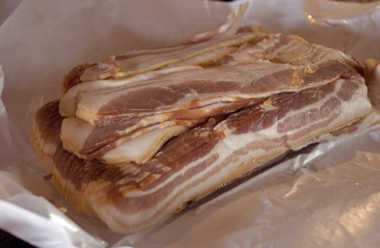
Pretty simple, really. Fry up some bacon, lots of it, find the model bacon strip in the batch, lay it on the scanner, scan it. Then eat the model. Drink some coffee. Then eat the rest. Raise the contrast and convert to a bitmap in Photoshop, save as a TIFF.
Now let’s open up Courier in Font Lab. There it is! We’ll add a new glyph cell and go to work there.
In Font Lab, we import the TIFF and draw the bacon around it using the Bézier cubic splines that we know and love from applications like Illustrator, except that, contrary to Illustrator, we can draw it in Font Lab without screaming at the computer and pulling our hair out.
Draw the bacon as carefully as you can, keeping in mind the decay in image quality when it is set in low-res environments like LCD monitors and iPhones. This is the toughest part of the task. Bacon has a more complex flavor and form than Courier and will likely be used only in display settings – and mostly at breakfast.
Step 2: Bacon Metrics
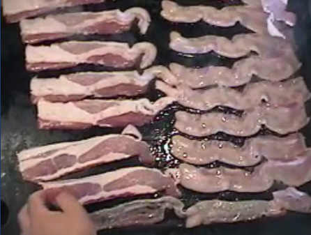
Look at this video image.
Just look at this beautiful picture. Do you see how Charles is spacing the bacon on the left? That’s how you should do it too. It’s no use having bacon in the DI Type if it’s going to be crashing into everything around it. So give it a left-side bearing and a right-side bearing. Well done, Charles!
If you were smart enough to use a primarily straight strip of bacon as your model, you’ll find that your bacon will require relatively few kerning pairs in the font. In fact, it may not require any at all. A crooked or curled bacon strip will undoubtedly cause some spacing problems with certain letters and require a set of kerning values.
Step 3: Writing the Bacon Feature
Here comes the part that all the computer geeks have been waiting for. How do you write a bacon feature in the OpenType Feature Language? It’s really easy.
First, your bacon has to have a name. Since there is no other glyph in Courier called “bacon,” you are free to use that name for your new glyph.
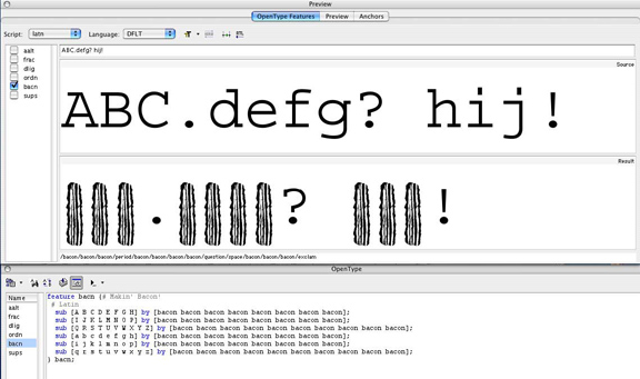
Now we are ready to write the bacon feature in the OpenType panel of Font Lab. Our bacon feature will involve basic Substitution – nothing more. A more complex routine like Conditional Substitution is not necessary for our bacon feature, because at DesignInquiry, bacon is usually eaten unconditionally.
Here it is:
Now we compile the code and check it out in the Preview panel.
It looks swell! I can hear the DI Type sizzling! Generate the font (via the File menu) and load it into your Fonts folder. You’re ready to go!
Now let’s start up InDesign. While we’re waiting for the application to load, I can tell you that I’m currently using a secret beta of CS6 which Adobe sent me last week and – oh look! – Adobe seems to have anticipated our new feature – there’s a Bacon Button!
OMG! It’s right here!
Of course, as you have probably guessed, I have been writing this whole article in the new DI Type. Now comes the part that all of the theoreticians and academics have been waiting for. The following is a critical analysis of the conceptual and cultural significance of putting bacon into Courier. At the same time, we’ll get to see how that new feature works out.
