

Design Less Ness
A Presentation on Designing Less _____; And Doing More _______.
Lucinda Hitchcock
Vinal Haven, Maine, June 2009
I began my presentation with words on the screen, (shown here, separated by semicolons), one phrase faded out as the next phrase faded in:
design less; design more?; design more; de-sign; un-sign; stop-sign; stop signing; design less! (as an imperative?); design-less (as an adjective?); design-less culture; things made design-lessly; design less (fill-in-the-blank); design less junk; design-less junk; design less stuff; design less nonsense; design less obliquely; design less habitually; design less egotistically; design less subversively; design less overtly; design less myopically; design less soulless, meaningless, vacuous, self-referential stuff.;
and
design more; design more work that: challenges; pleases; connects; beautifies; broadens; speculates; articulates; argues; directs; defines; narrates; shows; frames; posits; tells; teaches!
My current design practice is mostly concerned with making opulent books for museums and galleries. It is fun, certainly, but it is decidedly not a “designless” practice. But the praxis that interests me most deeply and genuinely these days, is developing projects and curricula for my students at Rhode Island School of Design, where I teach full time. Where I can, I incorporate narrative as a lens through which students can approach design work during their art school experience. I find that this opens conversation, deepens thinking, and encourages risk-taking. We all know what a story is, and when you approach graphic communication as a branch of story telling, a connection with student imaginations can usually be made.
I studied literature both as an undergraduate and again as a graduate student, and my first jobs after graduate school were in the editorial departments at various publishing houses, and it was there that I began looking over the shoulders of the in-house graphic designers. I noticed that they were grappling with something that I found fascinating: the visual representation of the written word. Making the shift from the mostly verbal to the mostly visual realm (through some miracle I was accepted into an MFA program for graphic design), I became involved not only with learning to design verbal and textual expressions in two-dimensions (typography, layout, composition), but also with how the verbal and poetic could be conjured in the three-dimensional realm: how are messages framed/derived/formed in spatial settings and environments? I began to read: Kevin Lynch, Dolores Hayden, Lucy Lippard, Gaston Bachelard, among numerous others. I also read poetry, including Ranier Maria Rilke, and became intrigued by his notion that we “read” spaces, and that subconscious memory is deeply linked to locus, frame, and environs. This natural pathway from reading texts to reading spaces, led me from the consideration of setting type to setting sites. Later, when I was teaching, I continued to find ways to link these areas of interest.
When I prepared to join the ranks at Design Inquiry in June 2009, I decided that my connection to the topic “DesignLESS” could be through a discussion about teaching students to produce narratives rather than artifacts. Narrative, place, memory, setting; rather than thing, artifact, object, result. I encourage students to talk about the relationships and connections between things in situ, and to observe how meaning is made through the juxtapositions of environments and objects, texts and places, spaces and use, etc.
I opened my talk at D.I. with a sort of manifesto which performed the simple act of taking apart the term “Design Less” (see above). I enjoy how the phrase can be used as an adjective to describe a noun (as in motherless) or as an imperative (design less _____ [fill in the blank]); or as a suggestion of a condition (we might consider designlessness for the week on Vinal Haven). This manifesto/inquiry suggested that we might turn the question on its head and answer it from a position of strength. YES we must design less _____ and instead design more _____.
I shared some of the work I show my students in my classes at RISD (Making Meaning; Graduate Typography Studio; Sophomore Typography; Visual Narrative; Setting The Site: Type and Message in the Environment), along with some of the work produced in my classes. I was (I hope) able to draw the discussion forward to ask the question, what is our role in design education? Can we teach more while designing less? Does it make sense to do so? And as educators, what is our role in the design field? The participants at D.I., over the course of the following days, each shared with us, in his or her way, how they are “designing less” (or designing more, better). I find that for me, I am designing less (fewer) things, but I’m teaching, thinking, talking, reading, inspiring, showing, finding, connecting, imagining, seeking, seeing, more.
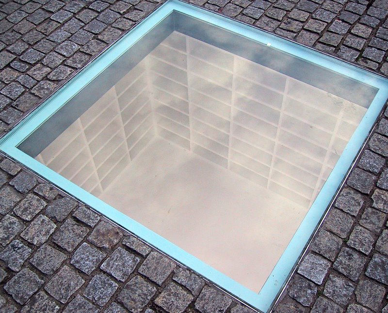
Setting the Site is an advanced class for graduate students and seniors at RISD. My course begins with an overview of work produced by various artists, architects, and designers who rely heavily on narrative and meaning as they work to express visual messages in unconventional ways. Examples of this kind of work can be seen in the beautiful memorial design by Micha Ullman. His astonishingly poignant piece at Bebelplatz in Berlin, designed to commemorate the burning of condemned books in the plaza by university students in 1933, is embedded deep in the ground, and viewed from the plaza above. One looks down through thick glass to a small square room whose white walls are entirely lined with book shelves all of which are empty.
Another example might be Maya Lin’s Vietnam memorial which used the most pared down and simple forms to visualize an extraordinary thing: a deep gash, a black wound in the earth. But the over-arching narrative in her tale has equally as much to do with the story of how a young Asian American female student got the memorial made and approved and eventually built, working against many political and military forces throughout the process.
I also showed the work of Renata Stih + Frieder Schnock who do amazing work around cultural memory, specifically in Germany. Their proposal for a Memorial to the Murdered Jews in Europe was rejected (along with numerous other applications) in favor of Peter Eisenmann’s enormous, physical, and monumental grid of rectangular concrete blocks. Stih + Schnock proposed a piece entitled “Bus Stop” which would have been a memorial-in-motion: an actual route inviting people to ride on bright red busses which would traverse the countryside, emblazoned with the names of the various possible destinations: Buchenwald, Auschwitz, and so on. But importantly, their proposal would have required that the site dedicated to the proposed Memorial, in the middle of the city’s most expensive real estate section, remain entirely empty. With nothing but a bus-stop sign.
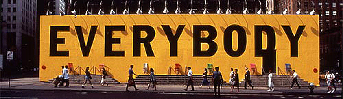
M+Co/Scott Stowell’s simple “Everybody” billboard simply and succinctly became an inclusive community-building gesture during a time when New York’s 42nd street, which in those days was largely comprised of pornography and strip joints, was under construction. Developers were attempting to “clean up” the area,and in doing so excluded and eventually ousted those businesses that had been occupying the stores and theaters for so many years.
These are just a few examples of the many kinds of work I introduce to my students. We discuss how this work communicates, narrates, tells and teaches, gestures and frames, advocates and invites without necessarily adding to the world’s overabundance of unnecessary items, stuff, ephemera and printed collateral. This work tells stories, creates place, creates community, evokes emotions, shapes opinion, invites and incites interaction, memorializes horrific events without relying on visual clichés, or overused and ubiquitous imagery, billboards or logo campaigns, posters or brochures. And the benefit of my class and this sort of work, is that to truly engage in a class such as this, students must immerse themselves deeply and genuinely into their chosen subject area.
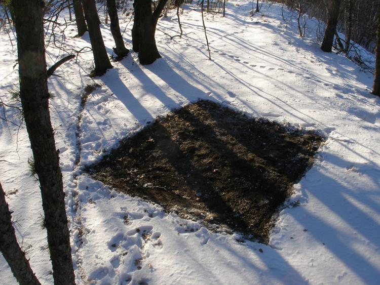
After observing and analyzing some of these artists and designers, students are then given projects in which they too are asked, in incremental steps, to arrive at a piece of work that memorializes an event (personal or public, monumental or banal) or tells a story in visual, structural, and physical ways. In one project the students are directed to only use what they find at a site. A lovely solution came from a student, Kai Salmela, who took a walk in the woods on a sunny day when there was still snow on the ground. Using only his (freezing cold) hands, he scraped away a large square in the middle of a slightly open space in the woods. A striking brown square in the white field resulted: a beautiful statement of form, meditation, portent of springtime coming. There was something moving & somber in the square earth, a burial ground, a place of endings as well as beginnings.
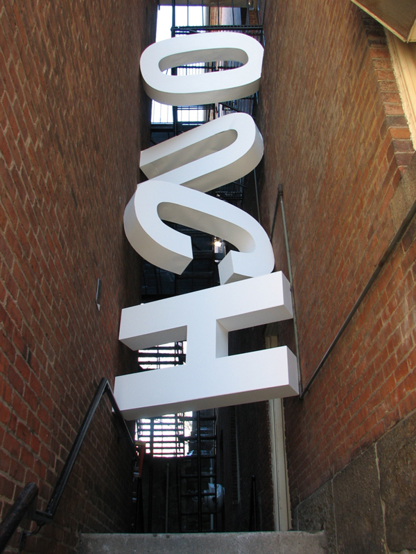
In a different project, where the students are asked to introduce a word into the environment, my student Vasily Davidov, made massive white letters that spelled in beautiful Universe capitals: OUCH and placed them in a site between two buildings which were just about to be renovated/replaced. The space was tight and the poetry of the piece came through it’s context: students loved that space, they delighted in the weird alleyway between these nearly-touching buildings. And the alleyway was about to disappear.
These examples (among others) were part of my contribution to the discussion at D.I. I hoped that by sharing what I do in my teaching, I might prompt a discussion about how students and designers might consider ways to pull us out of our computers, out of our self-referential focus, and into a place of opinion, heart, poetics, geography, context, cultural relevance, community, caring, responsibility, imagination, reverence, research, innovation, and grace.
Lucinda Hitchcock, D.I. 2009
Designless