…or A presentation of work that is not quite done, for a place I don’t yet fully understand
The presentation at DesignInquiry 2010 (Marfa) was intended as the start of a process rather than its culmination. The framing of an open-ended intention rather than showing finished work, it was to act as a proposal for building a typeface for Marfa, Texas. The proposal cited historical precedence to define parameters of the project. These examples illustrated work that embodied three interrelated characteristics pertinent to the proposed Marfa project: site-specific, place-reflective and position-oriented typography.
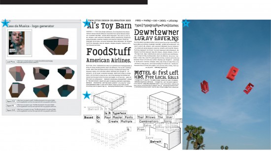
Typographic works that specifically required the presence of unique data from a physical site to create an integration with the location were identified as site-specific. Examples included Stefan Sagmeister’s Casa de Musica (2005) a fluid, malleable identity system that fixed placed-ness in typography through extractions of the visual elements from the museum’s existing architecture and archives; Optimo’s Detroit (1998) a typeface as response to place, an homage to the Motor City’s almost infinite range of decaying/softening structural details programmed as a Multiple Master font comprised of a range of details from hard edge to softly rounded; and Letterror’s Twin (2002) an expansive typographic system that reflected the broad range of daily environmental conditions in Minneapolis/St Paul and incorporated them in the letter forms.
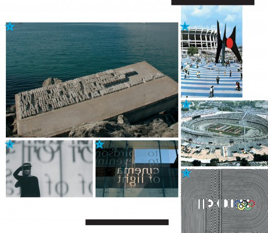
Place-reflective work encompassed pervasive systems that responded to a location, or represented an aspect of the place as subject. Examples included the 1968 Mexico City Olympics visual identity, by Pedro Vázquez, Alfonso Sorio, Lance Wyman and Edwardo Terrazas, which manifested flexible articulations of the visual characteristics of indigenous/local culture. Another example shown was the Mexico City subway system developed by Lance Wyman in 1969, a signage system that employed non-textual visual cues to facilitate spacial navigation of the transportation system by the large non-literate indigenous population as well as benefiting non-Spanish speaking visitors.
Work that predicated the necessity of inhabiting a place, or a particular perspective, to decode the intended meaning was described as position-oriented. Andrew Byrom’s Letter-Box-Kites (2008) letter forms built as kites needing to be flown to achieve legibility as well as the steel letters of his project St Julian (2009) whose forms were only visually completed as the viewer changed their own physical orientation in relation to the mounted letters. Another example was Catherine Griffith’s Wellington Writers Walk (2002), dimensional text sculptures installed around Wellington, New Zealand’s waterfront with visibility dependent on the ocean tides, and Ponatahi House (2003) a domicile wrapped in it’s own poem only readable from the inside by the viewer/inhabiter moving about the house.
The quality of modularity was introduced out out my own personal proclivity toward recombinable systems. The idea being that the project would entail a fixed system of elements that could be recombined to produce an expansive set of visually related type forms. Historical examples of modularity included Mathew Carter’s flexible serif system of the Walker typeface (1995), the Hamilton Mfg Co’s Unit Gothic (c.1915) a family of proportionally related sans serif typefaces and the modular compositional-type forms from Petibon’s Nouvèua Caractere Allongé, Gravé et Fondu (Paris, 1842).
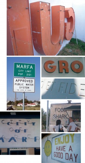
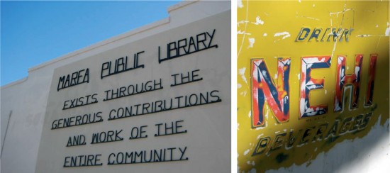
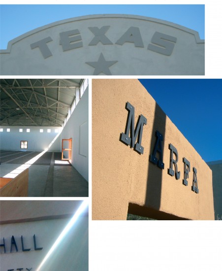
Finally, conditions from the site itself provided the most obvious components of the project proposal: Gothic letters and sun light. A san serif style letter appeared appropriate for the typeface proposal because of the predominance and ubiquity of early 20th century gothic letter forms in Marfa’s commercial and architectural signage. Most importantly, the quality of atmospheric light specific to Marfa, Texas. How this light seemed to physically fill up the space struck me, metaphorically, as an occupation, or the presence of an absence. Put another way, this light seemed to be a positive negative.
Building on historical precedence and the site’s own conditions it became apparent that the proposal would be to develop a modular sans serif typeface(s) intended to register and fix Marfa, Texas, as a place and would be designed with a particular physical perspective needed for viewing. Light (and shadow) would be active agents, requiring a particular orientation in time and space to visually complete the type, affording legibility.
____________________________________________________________________________________
Image Citations
1 Stefan Sagmeister, Casa de Musica (2005)
2 Letterror, Twin (2002)
3 Optimo, Detroit (1998)
Stephane Delgado, Gilles Gavillet, David Rust, “Detroit”
Whereishere (Ginko Press, 1998) pp 140–141.
4 Andrew Byrom, Letter-Box-Kites (2008)
5 Catherine Griffith, Wellington Writers Walk (2002)
6 Catherine Griffith, Ponatahi House (2003)
7 1968 Mexico City Olympics visual identity
Carolina Rivas and Daoud Sarhandi, “This is 1968…This is Mexico” Eye magazine, No 56 (Summer 2005). Eduardo Terrazas and Beatrice Trueblood, “Letters Eye 59: This is not Mexico” Eye magazine, No 59 (Spring 2006).
8 Mathew Carter’s Walker (1995)
9 Petibon, compositional letters (1842)
Petibon, Nouvèua Caractere Allongé, Gravé et Fondu (Paris, 1842)
10 Hamilton Mfg. Co, Unit Gothic (c.1915)
The Hamilton Mfg. Co., Specimens of Unit Gothics and Roman Flame Borders (Two Rivers, c.1915)
Thanks to Emily Luce for use of her two Marfa images on this panel.
